| NSU Home | NSU Store | In The Current Issue... | Contact Us | | |
Go  | New  | Find  | Notify  | Tools  | Reply  |  |
| Member |
 | |||
|
| Platinum Card Talk Member |
Wow, great art! | |||
|
| Manufacturer |
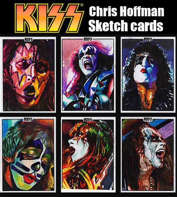
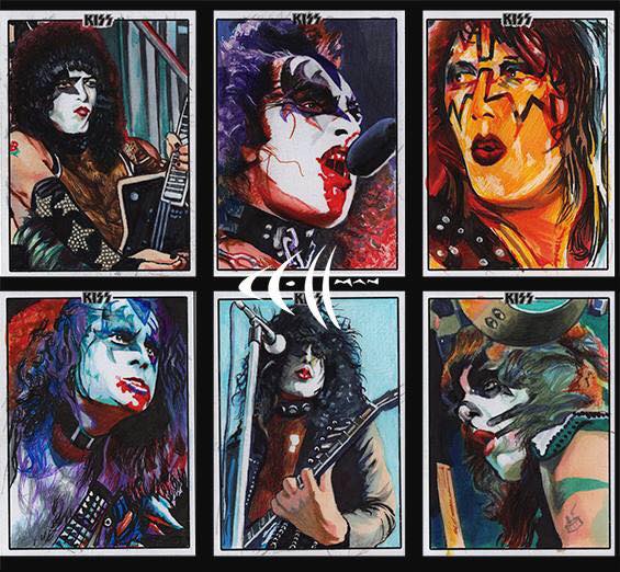
Chris Hoffman  | |||
|
| Manufacturer |
Chris Hoffman a  | |||
|
| Manufacturer |
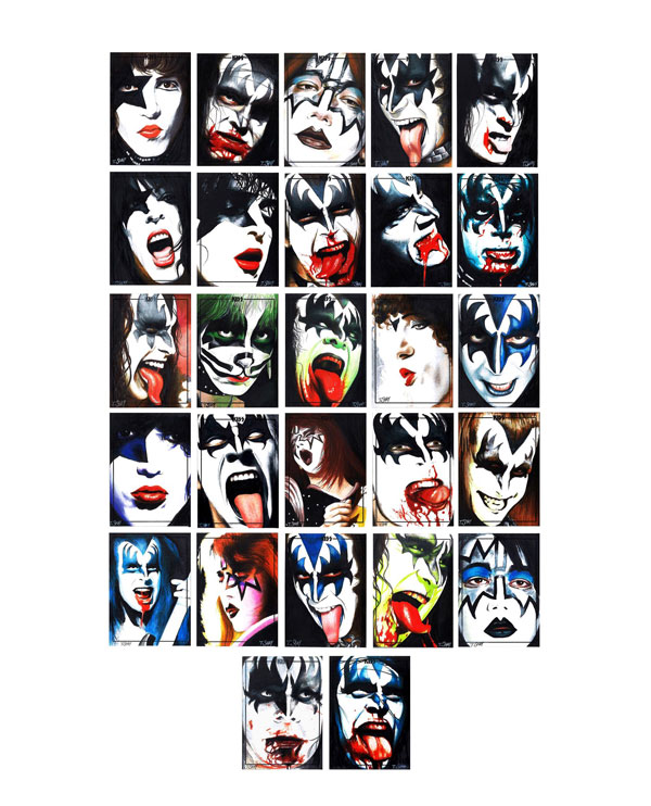
Tim Shay  | |||
|
| Platinum Card Talk Member |
Ok, I guess I am not a big enough KISS fan. Who the hell are these people? ____________________ Just because it's rare doesn't mean it's valuable. | |||
|
| Manufacturer |
starts shipping today I have posted information for Dynamic and I do not work for them. I am just helping them out with artists etc. | |||
|
| Platinum Card Talk Member |
I believe these are artists. | |||
|
| Platinum Card Talk Member |
Thanks Tom! Any chance you can post pics of the Gene and Paul signature cards? | |||
|
| Platinum Card Talk Member |
Yeah, I was kinda thinkin in that direction too but none of em are listed with the sketch artist. Strange ____________________ Just because it's rare doesn't mean it's valuable. | |||
|
| Platinum Card Talk Member |
Maybe these are artist who worked on KISS comics or something. . . | |||
|
| Platinum Card Talk Member |
Ahh that's it. Think the last time I read a KISS comic book it said "Marvel Comics Super Special" on it. ____________________ Just because it's rare doesn't mean it's valuable. | |||
|
| Bronze Card Talk Member |
Just seen images of the autograph cards. VERY glad I didn't bother trying to import any of this. | |||
|
| Platinum Card Talk Member |
It is unfortunate -- they did such a great job getting some big name signers, but then didn't bother to design a card with a spot for a signature. . . | |||
|
| Gold Card Talk Member |
What do the autos look like ? Can we see images ? | |||
|
| Platinum Card Talk Member |
I saw them on eBay. | |||
|
| Diamond Card Talk Member |
OK, well those autograph cards are very much in the old style used for comic characters like Evil Ernie. The signatures are just written any place on the front, sometimes across the picture when there is no obvious open space. Many times they used silver or gold ink, as it was easy for black to disappear into the usually colorful photo. Dynamic must have made the decision that they wanted them to look like those throw backs, or else they would have designed a signature box. I'm of a mind to think it's a case by case basis as to whether you like the look or not. As long as the signatures stand out, it's fine. If you have black ink disappearing into a dark background, then it isn't fine. The cards with better placed autographs should have more demand. | |||
|
| Platinum Card Talk Member |
I don't see any design here at all. If this was a decision to look like 'throw backs' . . . well . . . it's not for me.   | |||
|
| Diamond Card Talk Member |
For what it's worth, those autographs seem fairly clean, it's more the photo design that becomes the issue. If you look at the sketches, with the exception of Cover's on top, you have really tight, face focused images. Dynamic seems to have made a point of wanting to concentrate on the KISS make up. Some people will like that, some will find it boring, but it is the thing they are best known for as much as their music. For the auto cards it just has to lead to signatures scrawled across faces. Since these are on-card signatures I guess KISS didn't object to writing on their own faces. | |||
|
| Bronze Card Talk Member |
Excuses, excuses. Ugly cards are ugly cards | |||
|
| Powered by Social Strata | Page 1 2 3 4 |
| Please Wait. Your request is being processed... |
|

