| NSU Home | NSU Store | In The Current Issue... | Contact Us | | |
Go  | New  | Find  | Notify  | Tools  | Reply  |  |
| Moderator |
These might be variants, or they might just be ink color issues. Anyone have any info or thoughts? First up is from DC Milestone. The shade of tan is definitely different between the two cards. | ||
|
| Moderator |
Next is from Buffy Season Six, card B6-1. Note the different colored copyright info text. | |||
|
| Diamond Card Talk Member |
No info from the promo side of it, but as for thoughts on "color variants" for cards in general, I tend to dismiss most of them as being better called defects, if they even rise to that level. Subtle changes in shadings that may come from the production process don't qualify as a variant to me, although of course other collectors operate under their own standards. I used to have a big issue with one-color solid costume swatches that people would swear were variants, when the shade difference was either imperceptible to me or it was clearly due to fading. Anyway as regards your cards, I would view the Static as being too close in color to call it a variant. I see it, but I wouldn't care. For the Buffy, I would call that a defect in the register. Not really just the color, the text seems blurrier and out of contrast. It could be the scan, but if not, a poorer printing isn't a variant to me either. Again some collectors regard printing errors as variants, but for myself I have usually stuck with defects or incomplete cards as a better description. | |||
|
| Silver Card Talk Member |
Well I class both of them as colour variants. I already have several in my collection along with all sorts of other variants. regards John ____________________ | |||
|
| Moderator |
Good points as usual, Raven. I don't much care about production glitches/defects either, the ones that produce what is probably going on with the cards I posted. And the Buffy card backs were scanned at the same time so the one is blurrier. I like finding things that could be variations for the purpose of recording it. Someone, somewhere, at sometime...*might* be interested to know. I'm not a material card collector, or autos, and I don't myself understand the allure with "variants" in signature color, or swatches with designs. For my tastes ,the card itself needs a variation, not the ink color of a pen. | |||
|
| Moderator |
Yeah they are probably production related, and not due to reprinting. I figured I'd put them out there for discussion. | |||
|
| Moderator |
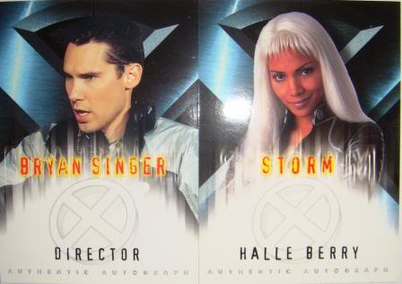
Here's another. Her hair is very different colored, but the scan may not represent it well. | |||
|
| Diamond Card Talk Member |
Not just the hair color, the whole facial skin tone is different. Were I to have my choice, I would pick the top card because it is brighter and more vibrate than the bottom one to me, at least in that scan. It looks like the better copy. I don't know that the comparison would make either one a variant or which one would be considered the majority example. I certainly wouldn't need both to complete the pair, but I wouldn't argue with anyone either way. Those that want to find a variant there, probably will see it. I would just add that besides production and printing issues, you can get color changes in cards from how they are displayed or stored or what effect light may have had on them. Sure autograph signatures can change color over time, but cards fade too and the amount and quality of surface gloss brings in another element. I tend to take a very strict and conservative view when it comes to declaring variant cards, yet as to your comment, I would consider autographs signed in red or blue ink to be variants if the majority of the copies were signed in black ink. So when it comes to it, we all make up our own rules. | |||
|
| Platinum Card Talk Member |
I don't consider color differences as variants either. They are just artifacts of the printing process. Maybe the printer was running out of a particular color so a similar color started to take over before someone noticed that it was time to stop and refill/replace. A shade change in a background or someone's hair might be interesting enough to some collectors but many won't chase something almost imperceptible and some won't even see it. I noticed a difference in colors in a Disneyland Tomorrowland promo that is more distinct because I was buying and trading them when they were new. A few years ago, I saw another one like it but have trouble calling it a variant since I'm pretty sure it was just a dark blue ink running out with other blues filling in, the one on the right being the one you usually see.  | |||
|
Gold Card Talk Member |
Back when ST 40th was released I was obsessed with costume card variants, such as this one. I ALMOST found every one I was looking for in the set. Hope this isn't considered a thread hi-jack. If so, I will gladly delete the post!  | |||
|
| Platinum Card Talk Member |
Uhhhhh, it is a color variant. I'm going to allow it. | |||
|
| Diamond Card Talk Member |
Yes, but these types of costume cards bring up a slightly different wrinkle in the discussion of color variants. The source material is not a solid color or even multiple sectional colors. It's a mixed print. Every small swatch can come out differently since it just depends on which part of the dress it was taken from. It therefore is difficult to come up with a majority color or print pattern. Can you call any of those cards a variant without establishing the majority card? Or do you just say that they are all variants, but there is no premium for any of them because there is no majority color or print pattern that would be the normal swatch? That's what I would say here. For this costume card, all variants are as normal as each other and it would be hard to know how to price them without determining the approximate quantity of each like-color or like-pattern swatch. Which is most common, which is the rarest? You might never know for sure with so many possible examples. It would make for a nice quest if you wanted to get them all though. | |||
|
Gold Card Talk Member |
There are some costume cards where the material is obviously from a small(er) part of the costume, such as this X-FILES costume, of which I also believe a white and a yellow/black version exist, although I never found ones to buy. In my opinion, the all black one is "common" while the others are "rare" and therefore command higher prices.  | |||
|
| Platinum Card Talk Member |
Yeah, I guess they would all be variants unless a certain costume is mostly one color or pattern. I was just thinking that the costume card idea must be getting old by now. Rather than cutting up clothing into bits, maybe the companies could do sketches of the costumes. They wouldn't need to show close likenesses of the actor/actress since the focus is on the costume. Jess
| |||
|
Gold Card Talk Member |
Since I've quit collecting (mostly), the only costume/pieceworks cards I'll buy in the future will be any they do on the upcoming She Hulk TV show. But you've probably already guessed that. | |||
|
| Moderator |
I was thinking about that Buffy one I posted above...I would think that if it was a color issue then all the other white letters would be affected, but its only the copyright info. Not true? | |||
|
| Diamond Card Talk Member |
Yeah don't really know what to say about that one. The copyright writing seems to lack clarity, as well as having a grayer tone compared to the white lettering on the other card. Sometimes you see something like that when material is copied, but the card isn't, so still leaning toward a printing issue. But let's say that it would qualify as a variant for some people. Is it a variant worth looking for or buying? If it is an inferior copy, but still regarded as a variant by some, do people want it? I wouldn't, but I have seen collectors seek out blank backed cards and cards that missed the foil borders and all manner of other oddities that I call defects, including double exposures and off centered photos. When does poor quality control turn into a rare card? Beats me. | |||
|
| Member |
Interesting topic. I came across lots of color differences on the backs of Topps 2017 WWE Women's Division cards when I was putting together a bunch of base sets last year. Some seemed to have more purple in the grey background than others. It's not what I would consider a variant, just a byproduct of the printing process. Curiously, just last night I was reading about promo cards for the 1993 Marvel Masterpieces set. The House of Checklists has two Venom promos, one with black printing and one with gray printing. The gray printing version has a number (P8) and is scarcer than the black printing version, which was distributed at San Diego Comic-Con. I haven't been able to find a picture of the P8 gray printing version anywhere. Assuming both cards exist, the fact one has a number makes it a different card, right? But would having different text color be enough to call them different cards? | |||
|
| Platinum Card Talk Member |
I haven't seen an example of the 1993 Marvel Masterpieces Venom promo with the gray text and P8 number either. If it were just the text color difference, I wouldn't think of it as a variation other than an artifact of the printer running out of black ink.
| |||
|
| Platinum Card Talk Member |
Here's an example of color variants. PCE2008 lists the Angry Christ promo (Sirius, 1994) as having two variants with the character on the front in either a green or purple outfit. I don't have examples of that to show but I did notice that there are also variants in text color on the backs (title and Heroes Convention logo) - again in green and purple although the logo color difference is more yellow than green.  | |||
|
| Powered by Social Strata | Page 1 2 |
| Please Wait. Your request is being processed... |
|

